---
title: "Explainability Practice"
author: "Fei Huang, UNSW Sydney"
urlcolor: blue
bibliography: reference.bib
biblio-style: apalike
link-citations: true
reference-location: document
resources:
- "Case Study/pg15training.csv"
other-links:
- text: In-class slides
href: Slides-Explainability-Practice.slides.html
icon: easel2
format:
html:
code-fold: true
code-tools: true
code-copy: true
smooth-scroll: true
toc: true
toc-depth: 3
format-links: false
pdf:
documentclass: article
pdf-engine: xelatex
toc: true
toc-depth: 3
geometry: margin=0.6in
fontsize: 9pt
colorlinks: true
include-in-header:
text: |
\usepackage{fvextra}
\fvset{breaklines,breakanywhere}
execute:
echo: true
warning: false
message: false
error: false
cache: true
freeze: auto
jupyter: conformal_prediction
---
# Background
As predictive models used in high-stakes decisions grow more complex, they also become harder to understand and communicate than traditional linear models. This holds regardless of domain. Insurance pricing, credit scoring, hiring, and healthcare risk assessment all face the same trade-off between flexibility and transparency. Post-hoc explainability methods let practitioners inspect what a fitted model is actually doing, independently of the model class.
The importance of model interpretability has also been recognised by regulators and industry practitioners. Guidance on the regulatory review of predictive models developed by the National Association of Insurance Commissioners (NAIC) [@naic2025modelreview] highlights the growing use of increasingly complex predictive modelling techniques in insurance and the challenges they create for model review and regulatory oversight. As predictive models become more complex, regulators require appropriate documentation, governance, and review procedures to assess and understand model behaviour when evaluating insurance rating plans.
Similar concerns have been raised by the actuarial profession. A Society of Actuaries (SOA) report on interpretable machine learning [@baeder2021iml] identifies lack of interpretability as a major barrier to the adoption of complex machine learning models in insurance. The report argues that actuaries, regulators, and other stakeholders need tools that help them understand the relationships between model inputs and outputs, assess whether model behaviour is reasonable, and communicate model results to affected audiences. The same argument applies wherever a complex model informs a decision about a person. A loan applicant, a job candidate, or a patient is entitled to the same kind of scrutiny as an insurance policyholder.
This chapter provides an introduction to a range of post-hoc interpretation techniques that can be applied to any fitted predictive model. Using a private motor insurance portfolio as the worked example, claim frequency (how often claims occur, per year a policy is in force), claim severity (the average cost of a claim when one occurs), and pure premium (the expected claim cost per policy, that is, frequency times severity, the risk-based part of a premium before expenses and profit are added) models are fitted using Extreme Gradient Boosting (XGBoost, a machine learning method that builds an ensemble of decision trees, where each new tree corrects the errors made by the trees before it). The fitted models are then examined using a range of global and local interpretation tools to better understand the drivers of model predictions, the relationships between predictors and outcomes, and the interactions captured by the model.
<!-- The objective is not to compare predictive models, but rather to understand what different interpretation techniques reveal about the behaviour of a machine learning pricing model and how the insights provided by different tools may complement one another. -->
# Learning Objectives
By the end of this chapter, you are expected to be able to:
- Operationalise a suite of post-hoc explainability methods, including permutation importance, PDP/ALE, SHAP, and interaction detection, end-to-end on a fitted model.
- Explain why model interpretability matters for predictive models used in high-stakes decisions, illustrated here in an insurance pricing context.
- Interpret global variable importance measures, including their limitations, and distinguish global from local explanations.
- Use partial dependence plots (PDPs) and accumulated local effects (ALE) plots to investigate how individual predictors affect model output.
- Interpret SHAP values, both globally and for individual predictions, and compare them against other interpretation techniques.
- Investigate interaction effects between predictors using Friedman's H-statistic and SHAP interaction values.
- Critically assess the strengths and limitations of commonly used post-hoc interpretation tools.
- Communicate interpretation results to technical and non-technical stakeholders.
# From principle to practice
Explaining a fitted model, whatever the domain, follows a similar sequence:
1. **Fit an accurate model.** Explainability tools describe what a model does. They cannot fix a model that does not fit the data.
2. **Check global feature importance** to identify which predictors drive the model overall (built-in importance, permutation importance).
3. **Check main effects** for the most important predictors, using PDP and ALE, to see the shape of each predictor–prediction relationship.
4. **Check individual predictions** using local SHAP values, to see how a specific case arrives at its output.
5. **Check interactions** between predictors, using Friedman's H-statistic and SHAP interaction values, to see where the additive picture from steps 2–4 breaks down.
6. **Validate stability and communicate** the results to the audience that needs them, whether technical reviewers, regulators, or the individual affected by a decision.
This chapter works through steps 2–6 in full, on a single worked example, so each step above has a concrete implementation to point to.
# Case study: insurance pricing
The same insurer's pricing model from Chapter 3 is now in production, and a policyholder complaint has escalated into a formal dispute over their premium. The actuarial team must do more than confirm the model performs well on average. It has to explain that one customer's price in terms the customer, and potentially a regulator, will accept as a genuine account of the decision rather than an after-the-fact justification. That is the difference between an accurate model and a defensible one.
The same workflow (fit → global importance → main effects → local explanations → interactions → validate and communicate) applies to any tabular ML model used for a high-stakes decision, e.g., credit scoring, hiring, or healthcare risk models.
We use the `pg15training` dataset, originally distributed via the `CASdatasets` R package [@dutang2020package] and originally released for the first French motor insurance pricing competition organised by the French Institute of Actuaries in 2015. A CSV export ([`Case Study/pg15training.csv`](Case%20Study/pg15training.csv)) is provided alongside this chapter, so the Python code below does not require installing `CASdatasets`. The dataset contains 100,000 third-party liability (TPL) motor insurance policies observed during 2009 and 2010. TPL insurance covers damage caused to third parties when the insured driver is responsible for an accident. In this case study, we focus on third-party material damage claims, which occur more frequently than bodily injury claims in the dataset.
The dataset includes information on policyholder characteristics, vehicle attributes, policy characteristics, exposure periods (the fraction of a year each policy was in force, used to annualise claim counts and costs), and claim outcomes. Several variables commonly used in insurance pricing are available, including age, bonus-malus level (a no-claims discount/surcharge score, explained in detail below), vehicle type, vehicle value, occupation, population density, and other policyholder characteristics. These variables are used to predict claim frequency, claim severity, and pure premium.
The first 21 records are removed prior to modelling because they are duplicate observations with non-zero claim counts but zero claim amounts. After their removal, the dataset contains exactly 50,000 policies from each year (2009 and 2010), corresponding to the final competition dataset.
# Data Preparation and Model Setup
## Data Preparation
The following code loads the required packages and prepares the insurance pricing data used throughout the case study.
```{python}
#| label: load-packages
#| code-summary: "Show package imports"
from pathlib import Path                                # OS-independent handling of the CSV file path

import numpy as np                                       # numerical arrays and vectorised math (log, quantiles, ...)
import pandas as pd                                       # tabular data handling for the insurance dataset
import matplotlib.pyplot as plt                           # plotting importance rankings, PDP/ALE, and interaction surfaces

from sklearn.model_selection import train_test_split      # splits the data into training and test sets
from sklearn.metrics import (
    mean_squared_error,       # used to build RMSE for all three targets
    mean_poisson_deviance,    # the natural error measure for the Poisson frequency model
    mean_gamma_deviance       # the natural error measure for the Gamma severity model
)

import xgboost as xgb        # gradient boosting library used to fit the frequency, severity, and Tweedie models
import shap                  # computes Shapley-value (TreeSHAP) explanations for the fitted XGBoost models
```
```{python}
#| label: global-options
#| code-summary: "Show global settings"
DATA_PATH = Path("Case Study/pg15training.csv")

RANDOM_STATE = 903   # fixes every random split/sample below, so results are reproducible on re-run

OUTPUT_SAMPLE_SIZE = 5000

PDP_SAMPLE_SIZE = 5000
ALE_SAMPLE_SIZE = 10000
SHAP_SAMPLE_SIZE = 5000
INTERACTION_SAMPLE_SIZE = 3000
SHAP_INTERACTION_SAMPLE_SIZE = 3000
```
The above global settings define the random seed and the sample sizes used throughout the case study. Several interpretation methods, such as PDP, ALE, SHAP, and interaction analysis, are computed on subsamples of the data to reduce computation time while preserving the main interpretation results.
```{python}
#| label: load-prepare-data
#| code-summary: "Show data preparation code"
def load_pg15training(path=DATA_PATH):
    return pd.read_csv(path)

def prepare_pg15training(data):
    data = data.copy()

    # Remove the first 21 duplicate rows.
    data = data.iloc[21:].copy()

    # Exposure is recorded in days; converting to a fraction of a year makes
    # frequency and premium below annualised and comparable across policies
    # that were observed for different lengths of time.
    data["Exposure"] = data["Exppdays"].astype(float) / 365.0
    data["ClaimNb"] = data["Numtppd"].fillna(0).astype(float)
    data["ClaimTotal"] = data["Indtppd"].fillna(0.0).astype(float)

    # Drop any residual invalid rows (e.g. non-positive exposure), which would
    # make frequency or premium below undefined or nonsensical.
    data = data.loc[
        (data["Exposure"] > 0)
        & (data["ClaimNb"] >= 0)
        & (data["ClaimTotal"] >= 0)
    ].copy()

    data["ClaimFrequency"] = data["ClaimNb"] / data["Exposure"]
    data["PurePremium"] = data["ClaimTotal"] / data["Exposure"]

    # Severity (average cost per claim) is only defined where a claim actually
    # occurred; leave it as NaN elsewhere rather than dividing by zero.
    data["ClaimSeverity"] = np.nan
    positive_claim = data["ClaimNb"] > 0
    data.loc[positive_claim, "ClaimSeverity"] = (
        data.loc[positive_claim, "ClaimTotal"]
        / data.loc[positive_claim, "ClaimNb"]
    )

    # Mark these as categorical so later one-hot encoding treats them as
    # discrete labels rather than (meaningless) numeric codes.
    categorical_cols = [
        "Gender", "Type", "Category", "Occupation",
        "Adind", "SubGroup2", "Group2"
    ]

    for col in categorical_cols:
        if col in data.columns:
            data[col] = data[col].astype("category")

    return data

raw = load_pg15training()
full = prepare_pg15training(raw)

print(full.shape)
print(
    full[
        ["Exposure", "ClaimNb", "ClaimTotal", "ClaimFrequency", "PurePremium"]
    ].describe()
)

print("Bonus range:", full["Bonus"].min(), "to", full["Bonus"].max())
print("Age range:", full["Age"].min(), "to", full["Age"].max())
```
### Selected Rating Factors
::: {.callout-note title="Age and Bonus-Malus Variables"}
Two rating factors (variables an insurer uses to set the price of a policy) play a particularly important role throughout this case study, **Age** and **Bonus**.
**Age**
: Represents the driver's age in years. In France, drivers are legally permitted to drive from age 18.
**Bonus**
: Represents the French bonus--malus coefficient, a compulsory no-claim discount system used in motor insurance.
New drivers typically begin with a coefficient of 1.0. Each claim-free year reduces the coefficient by 5%, eventually reaching a minimum value of 0.5, while at-fault claims increase the coefficient by 25%, up to a maximum value of 3.5.
In this dataset, negative values correspond to premium discounts, whereas positive values correspond to premium surcharges. For example, −30 represents a 30% bonus, while 20 represents a 20% malus.
These two variables are introduced here because they will be used repeatedly to illustrate the interpretation techniques discussed later in the case study.
:::
## Model Setup
### Train-Test Split
The following variables are used as predictors:
```{python}
#| label: define-predictors
#| code-summary: "Show predictor list"
features = [
    "Gender",
    "Type",
    "Category",
    "Occupation",
    "Age",
    "Group1",
    "Bonus",
    "Poldur",
    "Value",
    "Adind",
    "SubGroup2",
    "Group2",
    "Density",
]
```
```{python}
#| label: split-data
#| code-summary: "Show train-test split code"
train, test = train_test_split(
    full,
    test_size=0.30,
    random_state=RANDOM_STATE,
    shuffle=True
)
```
The data are randomly divided into training and test sets using a 70/30 split. The training set is used to fit the models, while the test set is used to evaluate predictive performance and investigate the behaviour of the fitted models.
### Design Matrices
```{python}
#| label: create-design-matrices
#| code-summary: "Show design matrix code"
def make_design_matrix(data, features=features):
    # One-hot encode every categorical predictor into 0/1 indicator columns,
    # since XGBoost (like most ML libraries) requires purely numeric input.
    return pd.get_dummies(data[features], drop_first=False)

def align_design_matrices(train_data, test_data, features=features):
    X_train = make_design_matrix(train_data, features)
    X_test = make_design_matrix(test_data, features)

    # A category present in only the training set (or only the test set) would
    # otherwise leave X_train and X_test with mismatched columns; align() adds
    # any missing indicator column filled with 0, so both matrices line up
    # exactly, column for column.
    X_train, X_test = X_train.align(
        X_test,
        join="left",
        axis=1,
        fill_value=0
    )

    return X_train, X_test

X_train, X_test = align_design_matrices(train, test)

print(X_train.shape)
```
XGBoost requires numerical input features. Therefore, categorical variables are converted into indicator variables using one-hot encoding. The resulting design matrices are then aligned so that the training and test sets contain the same indicator variables, even if some categorical levels appear in only one dataset.
# Model Fitting and Evaluation
This case study considers two commonly used approaches for modelling insurance pure premiums.
- The first approach uses separate frequency and severity models. Claim frequency is modelled using an XGBoost Poisson model, while claim severity is modelled using an XGBoost Gamma model. The predicted pure premium is then obtained by multiplying the predicted claim frequency and predicted claim severity.
- The second approach directly models pure premium using an XGBoost Tweedie model. The Tweedie distribution (a family of statistical distributions) is frequently used in insurance because it can accommodate non-negative outcomes containing a mixture of exact zeros and positive claim amounts, which matches how pure premium looks in practice, since most policies have no claims in a given year while the rest have a positive cost.
The predictive performance of these approaches is subsequently evaluated using standard performance measures appropriate for each target variable.
## XGBoost Model Training
```{python}
#| label: fit-frequency-model
#| code-summary: "Show frequency model fitting code"
freq_params = {
    "objective": "count:poisson",   # claim counts are non-negative integers
    "eval_metric": "poisson-nloglik",
    "eta": 0.03,                    # small learning rate, offset by more boosting rounds below
    "max_depth": 5,
    "min_child_weight": 1,
    "subsample": 0.8,               # row subsampling per tree, regularises against overfitting
    "colsample_bytree": 0.8,        # column subsampling per tree, same purpose
    "seed": 101,
}

# base_margin supplies exposure as a fixed offset on the log scale, so the model
# predicts claim COUNT (not frequency) directly; dividing by Exposure below then
# converts back to an annualised frequency. This is the standard way to fit a
# frequency model when policies are observed for unequal lengths of time.
dtrain_freq = xgb.DMatrix(
    X_train,
    label=train["ClaimNb"],
    base_margin=np.log(train["Exposure"])
)

dtest_freq = xgb.DMatrix(
    X_test,
    label=test["ClaimNb"],
    base_margin=np.log(test["Exposure"])
)

freq_model = xgb.train(
    params=freq_params,
    dtrain=dtrain_freq,
    num_boost_round=2500,
    evals=[(dtrain_freq, "train"), (dtest_freq, "test")],
    early_stopping_rounds=100,   # stop once test performance stalls, to avoid overfitting
    verbose_eval=False
)

pred_claim_count = freq_model.predict(dtest_freq)
pred_frequency = pred_claim_count / test["Exposure"].to_numpy()

print("Best iteration:", freq_model.best_iteration)
print("Best test score:", freq_model.best_score)
```
```{python}
#| label: fit-severity-model
#| code-summary: "Show severity model fitting code"
# Severity is only meaningful for policies that actually had a claim.
sev_train = train.loc[train["ClaimNb"] > 0].copy()
sev_test = test.loc[test["ClaimNb"] > 0].copy()

X_train_sev, X_test_sev = align_design_matrices(sev_train, sev_test)

sev_params = {
    "objective": "reg:gamma",   # severity is a positive, right-skewed cost
    "eval_metric": "gamma-nloglik",
    "eta": 0.03,
    "max_depth": 6,
    "min_child_weight": 1,
    "subsample": 0.8,
    "colsample_bytree": 0.8,
    "seed": 202,
}

# Weighting each row by its claim count lets a policy with several claims count
# proportionally more toward the fitted average severity than a policy with one.
dtrain_sev = xgb.DMatrix(
    X_train_sev,
    label=sev_train["ClaimSeverity"],
    weight=sev_train["ClaimNb"]
)

dtest_sev = xgb.DMatrix(
    X_test_sev,
    label=sev_test["ClaimSeverity"],
    weight=sev_test["ClaimNb"]
)

sev_model = xgb.train(
    params=sev_params,
    dtrain=dtrain_sev,
    num_boost_round=3000,
    evals=[(dtrain_sev, "train"), (dtest_sev, "test")],
    early_stopping_rounds=100,
    verbose_eval=False
)

# Align the full test design matrix to the severity model columns.
X_test_for_sev = X_test.reindex(columns=X_train_sev.columns, fill_value=0)
dtest_sev_all = xgb.DMatrix(X_test_for_sev)

# Predict severity for every test policy (not just those with claims), so it
# can be multiplied by predicted frequency below to get a pure premium for everyone.
pred_severity = sev_model.predict(dtest_sev_all)

print("Best iteration:", sev_model.best_iteration)
print("Best test score:", sev_model.best_score)
```
```{python}
#| label: fit-tweedie-model
#| code-summary: "Show Tweedie model fitting code"
tweedie_params = {
    "objective": "reg:tweedie",
    "eval_metric": "tweedie-nloglik@1.5",
    # power=1.5 sits between Poisson (1) and Gamma (2), matching pure premium's
    # mix of exact zeros (no claim) and positive, right-skewed costs (a claim occurred).
    "tweedie_variance_power": 1.5,
    "eta": 0.03,
    "max_depth": 5,
    "min_child_weight": 1,
    "subsample": 0.8,
    "colsample_bytree": 0.8,
    "seed": 303,
}

# As with the frequency model, exposure enters as a fixed log-scale offset, so
# the model predicts total claim COST (not a premium rate) directly.
dtrain_tweedie = xgb.DMatrix(
    X_train,
    label=train["ClaimTotal"],
    base_margin=np.log(train["Exposure"])
)

dtest_tweedie = xgb.DMatrix(
    X_test,
    label=test["ClaimTotal"],
    base_margin=np.log(test["Exposure"])
)

tweedie_model = xgb.train(
    params=tweedie_params,
    dtrain=dtrain_tweedie,
    num_boost_round=3000,
    evals=[(dtrain_tweedie, "train"), (dtest_tweedie, "test")],
    early_stopping_rounds=100,
    verbose_eval=False
)

pred_claim_total_tweedie = tweedie_model.predict(dtest_tweedie)
pred_pure_premium_tweedie = pred_claim_total_tweedie / test["Exposure"].to_numpy()

print("Best iteration:", tweedie_model.best_iteration)
print("Best test score:", tweedie_model.best_score)
```
The frequency, severity, and Tweedie models were tuned using early stopping. The selected number of boosting rounds corresponds to the iteration with the best validation performance.
## Evaluate Model Predictions
```{python}
#| label: evaluate-models
#| code-summary: "Show model evaluation code"
def rmse(actual, predicted):
    return np.sqrt(mean_squared_error(actual, predicted))

def normalized_gini(actual, predicted):
    actual = np.asarray(actual)
    predicted = np.asarray(predicted)

    # Rank policies by predicted risk, and separately by actual risk, then
    # compare how much of total claims is concentrated among the highest-ranked
    # policies under each ordering (the Lorenz-curve idea behind a Gini coefficient).
    order_pred = np.argsort(-predicted)
    order_actual = np.argsort(-actual)

    cumulative_actual_pred = np.cumsum(actual[order_pred])
    cumulative_actual_best = np.cumsum(actual[order_actual])

    total_actual = np.sum(actual)

    if total_actual == 0:
        return np.nan

    lorenz_pred = cumulative_actual_pred / total_actual
    lorenz_best = cumulative_actual_best / total_actual

    n = len(actual)
    random_line = np.arange(1, n + 1) / n   # the "no ranking ability" baseline

    gini_pred = np.sum(lorenz_pred - random_line)
    gini_best = np.sum(lorenz_best - random_line)   # the best possible (oracle) ranking

    if gini_best == 0:
        return np.nan

    # Normalise so 1.0 = perfect ranking, 0 = no better than random.
    return gini_pred / gini_best

pred_pure_premium_fs = pred_frequency * pred_severity

predictions = test.copy()
predictions["PredClaimCount"] = pred_claim_count
predictions["PredFrequency"] = pred_frequency
predictions["PredSeverity"] = pred_severity
predictions["PredPurePremium"] = pred_pure_premium_fs
predictions["PredClaimTotalTweedie"] = pred_claim_total_tweedie
predictions["PredPurePremiumTweedie"] = pred_pure_premium_tweedie

# Severity predictions are evaluated only on policies with positive claims.
sev_test_matrix = xgb.DMatrix(X_test_sev)
sev_test_pred = sev_model.predict(sev_test_matrix)

frequency_eval = pd.DataFrame([
    {
        "Model": "Frequency model",
        "Target": "Claim count",
        "RMSE": rmse(test["ClaimNb"], pred_claim_count),
        "Poisson Deviance": mean_poisson_deviance(
            test["ClaimNb"],
            np.maximum(pred_claim_count, 1e-12)
        ),
        "Observed Mean": np.mean(test["ClaimNb"]),
        "Predicted Mean": np.mean(pred_claim_count),
    }
])

frequency_eval.style.hide(axis="index")
```
```{python}
#| label: severity-evaluation
#| code-summary: "Show severity evaluation code"
severity_eval = pd.DataFrame([
    {
        "Model": "Severity model",
        "Target": "Claim severity",
        "RMSE": rmse(sev_test["ClaimSeverity"], sev_test_pred),
        "Gamma Deviance": mean_gamma_deviance(
            sev_test["ClaimSeverity"],
            np.maximum(sev_test_pred, 1e-12)
        ),
        "Observed Mean": np.mean(sev_test["ClaimSeverity"]),
        "Predicted Mean": np.mean(sev_test_pred),
    }
])

severity_eval.style.hide(axis="index")
```
```{python}
#| label: premium-evaluation
#| code-summary: "Show pure premium evaluation code"
premium_eval = pd.DataFrame([
    {
        "Model": "Frequency × Severity",
        "Target": "Pure premium",
        "RMSE": rmse(test["PurePremium"], pred_pure_premium_fs),
        "Normalized Gini": normalized_gini(
            test["PurePremium"],
            pred_pure_premium_fs
        ),
        "Observed Mean": np.mean(test["PurePremium"]),
        "Predicted Mean": np.mean(pred_pure_premium_fs),
    },
    {
        "Model": "Tweedie",
        "Target": "Pure premium",
        "RMSE": rmse(test["PurePremium"], pred_pure_premium_tweedie),
        "Normalized Gini": normalized_gini(
            test["PurePremium"],
            pred_pure_premium_tweedie
        ),
        "Observed Mean": np.mean(test["PurePremium"]),
        "Predicted Mean": np.mean(pred_pure_premium_tweedie),
    },
])

premium_eval.style.hide(axis="index")
```
The frequency and severity models both provide reasonable predictive performance, with predicted means close to the observed averages.
For pure premium prediction, the frequency--severity approach and the Tweedie model achieve broadly similar predictive accuracy. The frequency--severity approach produces slightly lower RMSE and slightly higher normalized Gini values, although the differences between the two approaches are relatively small.
Because the two modelling approaches produce broadly similar predictive performance, the subsequent interpretation examples selectively use either the frequency or Tweedie model to illustrate particular interpretation techniques while avoiding unnecessary duplication.
# Feature Importance
**Question this section answers:** *Which variables matter most to the model overall?*
Before investigating how individual predictors affect the model output, it is useful to first identify which variables are most influential. Feature importance methods provide a global summary of predictor relevance and are a natural starting point for model interpretation. They help focus subsequent analysis on the variables that contribute most to model predictions.
Feature importance methods provide a global summary of which predictors are most influential in a fitted model. They are often used as an initial diagnostic tool in interpreting complex machine learning models because they help identify the variables that contribute most strongly to model predictions.
However, feature importance measures should be interpreted with care. Different definitions of importance can lead to different rankings, and importance scores do not show the direction or shape of a variable's effect. For example, a variable may be important because it has a strong nonlinear effect, because it interacts with other variables, or because it acts as a proxy for other predictors.
In this section, we focus on the XGBoost frequency model and compare two types of feature importance measures, built-in XGBoost feature importance and permutation feature importance.
## XGBoost Built-in Feature Importance
Tree-based models such as XGBoost provide several built-in feature importance measures. Common choices include:
* **Weight**: the number of times a feature is used to split the data across all trees.
* **Gain**: the average improvement in the model objective obtained from splits using that feature.
* **Cover**: the average number of observations affected by splits using that feature.
These measures capture different aspects of feature usage. For example, a variable may have high weight if it is used frequently in the trees, while a variable may have high gain if it is used less often but leads to large improvements when it is selected.
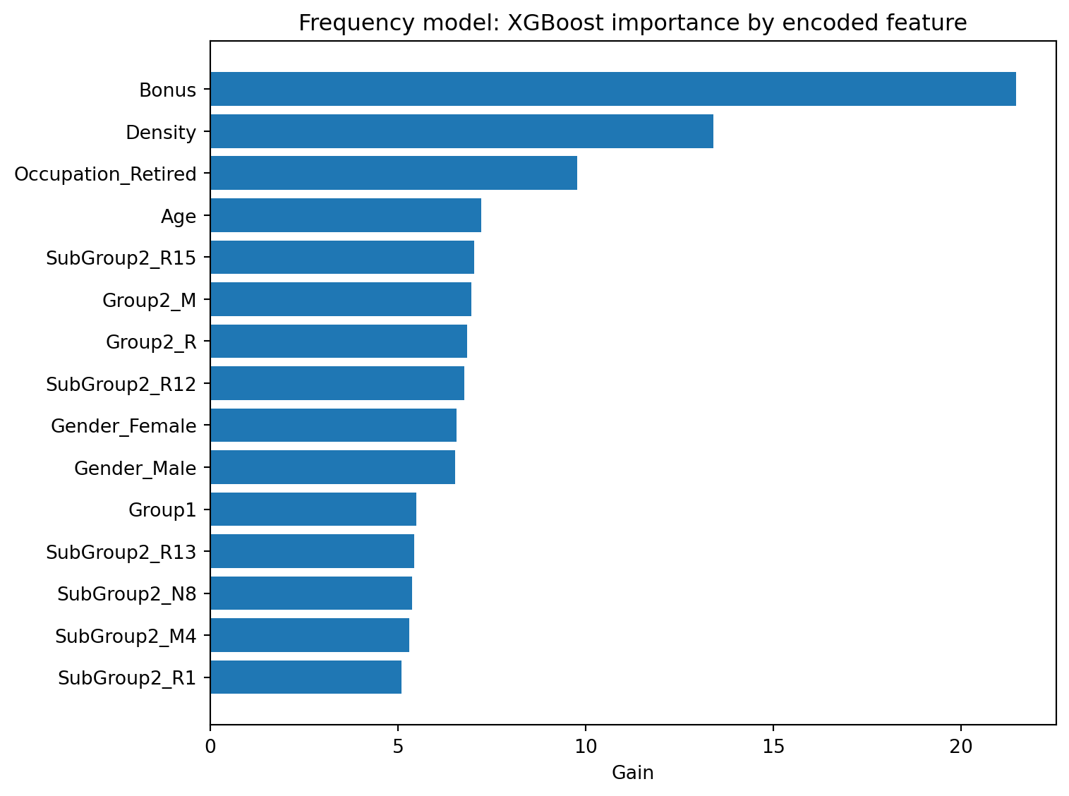
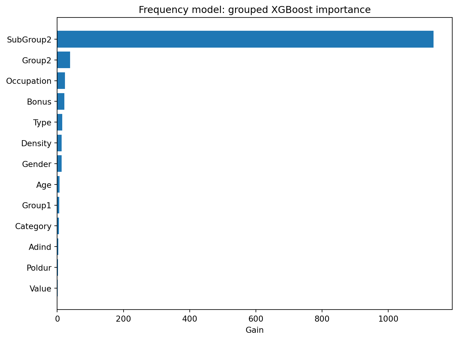
In this case study, we display feature importance based on **gain**, since gain is more directly related to improvement in model fit than simply counting how often a variable is used. We report both ungrouped importance, based on the encoded model features, and grouped importance, where dummy variables corresponding to the same original rating factor are aggregated.
```{python}
#| label: built-in-feature-importance
#| code-summary: "Show XGBoost feature importance code"
def group_feature_name(feature_name, original_features=features):
    # One-hot encoding turns e.g. "Gender" into "Gender_Male"/"Gender_Female";
    # this maps an encoded dummy column back to the original rating factor it
    # came from, so importance/SHAP values can be aggregated per rating factor
    # rather than per dummy level.
    for raw_feature in original_features:
        if feature_name == raw_feature or feature_name.startswith(f"{raw_feature}_"):
            return raw_feature
    return feature_name

def ungrouped_importance(model, importance_type="gain"):
    score = model.get_score(importance_type=importance_type)

    table = pd.DataFrame({
        "Feature": list(score.keys()),
        "Importance": list(score.values())
    })

    if table.empty:
        return pd.DataFrame(columns=["Feature", "Importance"])

    return table.sort_values("Importance", ascending=False)

def grouped_importance(model, importance_type="gain", original_features=features):
    table = ungrouped_importance(model, importance_type=importance_type)

    if table.empty:
        return pd.DataFrame(columns=["Variable", "Importance"])

    table["Variable"] = table["Feature"].apply(
        lambda x: group_feature_name(x, original_features)
    )

    # Sum each dummy column's importance back onto its parent rating factor.
    grouped = (
        table
        .groupby("Variable", as_index=False)["Importance"]
        .sum()
        .sort_values("Importance", ascending=False)
    )

    return grouped

def plot_importance_table(table, name_col, title, xlabel, top_n=15):
    plot_data = table.head(top_n).sort_values("Importance")

    plt.figure(figsize=(8, 6))
    plt.barh(plot_data[name_col], plot_data["Importance"])
    plt.xlabel(xlabel)
    plt.title(title)
    plt.tight_layout()
    plt.show()

frequency_gain_ungrouped = ungrouped_importance(
    freq_model,
    importance_type="gain"
)

plot_importance_table(
    frequency_gain_ungrouped,
    name_col="Feature",
    title="Frequency model: XGBoost importance by encoded feature",
    xlabel="Gain"
)

frequency_gain_grouped = grouped_importance(
    freq_model,
    importance_type="gain"
)

plot_importance_table(
    frequency_gain_grouped,
    name_col="Variable",
    title="Frequency model: grouped XGBoost importance",
    xlabel="Gain"
)
```
The grouped gain importance indicates that **SubGroup2** contributes substantially more to the reduction of the XGBoost objective function than the other rating factors. This occurs because the variable contains many categorical levels, allowing the model to use different splits for different categories. As a result, the total gain accumulated across all corresponding dummy variables can become very large.
By contrast, variables such as **Bonus**, **Age**, and **Density** appear less important after aggregation, even though several individual encoded features associated with these variables have relatively large gain values.
This example illustrates an important interpretational issue for built-in feature importance measures. Variables with many categories may receive disproportionately large importance scores because they generate many potential splitting points within the trees.
## Permutation Feature Importance
Permutation feature importance provides a model-agnostic alternative to built-in tree-based importance measures and was originally proposed by @breiman2001random in the context of random forests. Instead of relying on the internal (tree) structure of the fitted model, it measures how much model performance deteriorates when the values of a predictor are randomly shuffled.
::: {.callout-note title="Model-Specific and Model-Agnostic Interpretation Methods"}
Interpretation techniques are often classified as either **model-specific** or **model-agnostic**.
- **Model-specific methods** rely on the internal structure of a particular modelling approach. For example, XGBoost built-in feature importance uses information about tree splits and is therefore specific to tree-based models.
- **Model-agnostic methods** only require access to model predictions and can therefore be applied to a wide range of predictive models, including generalized linear models, tree-based models, neural networks, and other machine learning methods.
Permutation feature importance belongs to the second category because it evaluates how prediction performance changes when the information contained in a predictor is disrupted, without using any information about the internal structure of the fitted model.
:::
The general procedure for permutation feature importance is as follows:
1. Compute the baseline predictive performance of the fitted model on the test set.
2. Select one predictor variable.
3. Randomly permute the values of that predictor in the test set, while keeping all other variables unchanged.
4. Recompute the model predictions and evaluate the predictive performance.
5. Measure the increase in prediction error relative to the baseline.
6. Repeat this process several times and average the results.
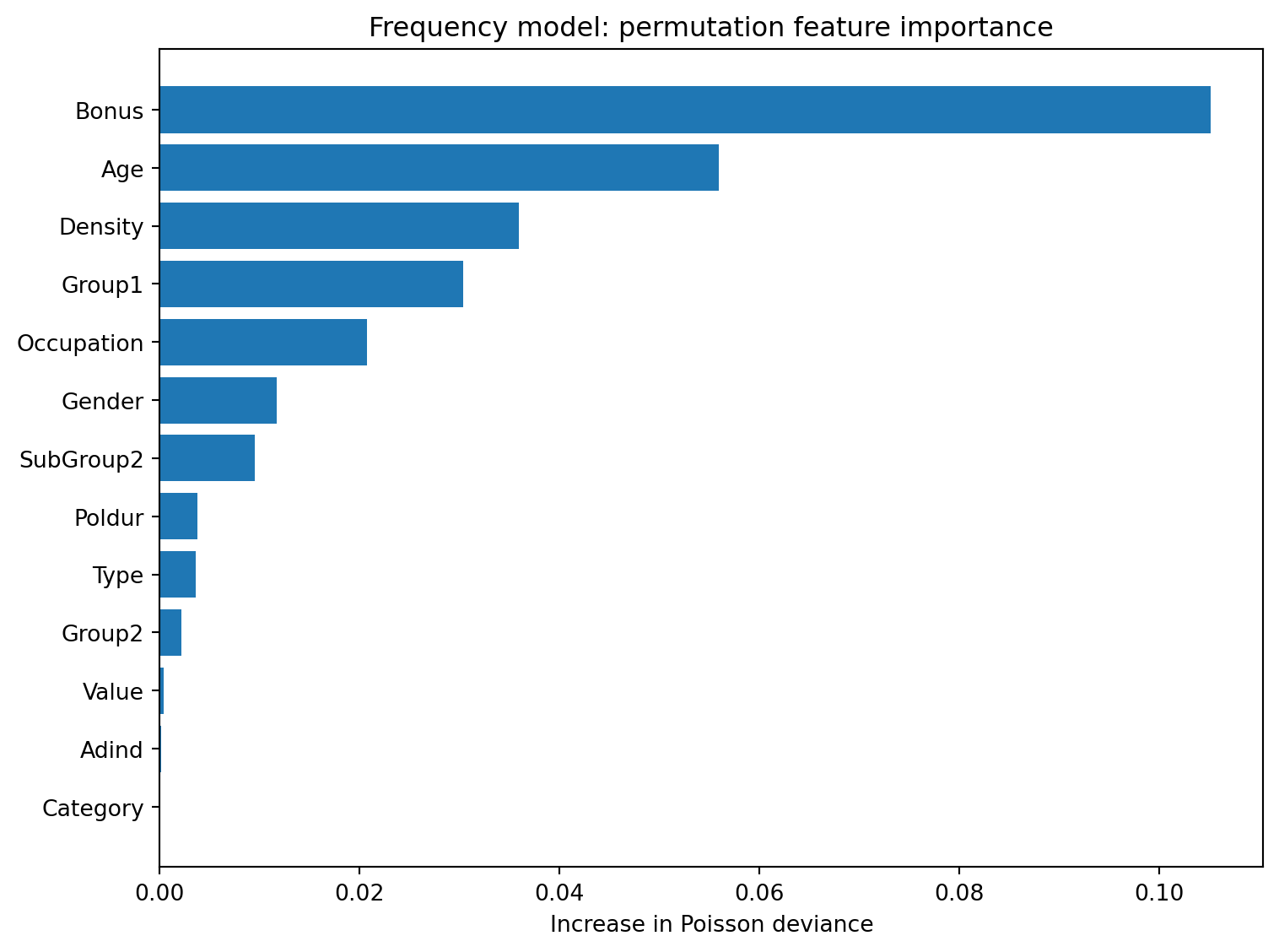
A variable is considered more important if permuting it leads to a larger deterioration in predictive performance. In this case study, the deterioration is measured using the increase in Poisson deviance for claim count prediction.
Permutation importance has the advantage of being easy to interpret and applicable to many different model classes. However, it can be affected by correlations between predictors. If two variables contain similar information, permuting one of them may have only a limited effect because the model can still use the other correlated variable.
```{python}
#| label: permutation-feature-importance
#| code-summary: "Show permutation feature importance code"
def poisson_deviance(actual, predicted):
    actual = np.asarray(actual, dtype=float)
    predicted = np.asarray(predicted, dtype=float)

    predicted = np.maximum(predicted, 1e-12)   # avoid log(0) / division by 0

    # The standard Poisson deviance formula; the actual == 0 case is handled
    # separately because the log(actual / predicted) term is undefined there.
    term = np.where(
        actual == 0,
        predicted,
        actual * np.log(actual / predicted) - actual + predicted
    )

    return 2 * np.mean(term)

def predict_frequency_claim_count(model, data, reference_columns):
    # Rebuilt from scratch (rather than reusing X_test) so this same function
    # also works on the permuted copies of the data created below.
    X = make_design_matrix(data).reindex(
        columns=reference_columns,
        fill_value=0
    )

    dmatrix = xgb.DMatrix(
        X,
        base_margin=np.log(data["Exposure"])
    )

    return model.predict(dmatrix)

def permutation_importance_frequency(
    model,
    data,
    variables,
    reference_columns,
    n_repeats=5,
    random_state=RANDOM_STATE
):
    rng = np.random.default_rng(random_state)

    baseline_pred = predict_frequency_claim_count(
        model,
        data,
        reference_columns
    )

    baseline_score = poisson_deviance(
        data["ClaimNb"],
        baseline_pred
    )

    rows = []

    for variable in variables:
        scores = []

        for _ in range(n_repeats):
            # Shuffle just this one column, breaking its link to the outcome
            # while leaving every other predictor (and their correlations) untouched.
            permuted_data = data.copy()
            permuted_data[variable] = rng.permutation(
                permuted_data[variable].to_numpy()
            )

            permuted_pred = predict_frequency_claim_count(
                model,
                permuted_data,
                reference_columns
            )

            permuted_score = poisson_deviance(
                permuted_data["ClaimNb"],
                permuted_pred
            )

            # Importance = how much worse the model gets once this variable's
            # real information has been destroyed.
            scores.append(permuted_score - baseline_score)

        rows.append({
            "Variable": variable,
            "Importance": np.mean(scores),   # averaged over repeats to reduce noise
            "Std": np.std(scores)
        })

    return (
        pd.DataFrame(rows)
        .sort_values("Importance", ascending=False)
        .reset_index(drop=True)
    )

frequency_permutation_importance = permutation_importance_frequency(
    model=freq_model,
    data=predictions,
    variables=features,
    reference_columns=X_train.columns,
    n_repeats=5
)

plot_importance_table(
    frequency_permutation_importance,
    name_col="Variable",
    title="Frequency model: permutation feature importance",
    xlabel="Increase in Poisson deviance"
)

frequency_permutation_importance.style.hide(axis="index")
```
The permutation results provide a rather different ranking of predictor importance. Variables such as **Bonus**, **Age**, and **Density** produce the largest increases in Poisson deviance when permuted, indicating that these variables contribute substantially to predictive performance.
In contrast, **SubGroup2**, which dominated the grouped gain importance measure, appears considerably less important according to permutation importance. This suggests that although the variable is frequently used within the tree structure, the predictive information it provides may overlap with other rating factors.
The comparison demonstrates that different importance measures answer different questions. Gain importance describes how frequently and effectively variables are used within the fitted trees, whereas permutation importance measures the deterioration in predictive performance when information from a variable is removed.
::: {.callout-note title="Interpreting Feature Importance"}
Different feature importance measures answer different questions and may therefore produce substantially different rankings of predictor importance.
Built-in tree importance measures describe how variables are used within the fitted model, whereas permutation importance measures quantify the deterioration in predictive performance when the information contained in a variable is disrupted.
Consequently, it is often helpful to examine several importance measures rather than relying on a single ranking.
:::
# Understanding Main Effects with PDP and ALE
**Question this section answers:** *How does each variable influence the predicted outcome, and in which direction?*
Knowing that a variable is important is only the first step. The next question is this. What does the model actually do with it? Is the relationship monotone or nonlinear? Does risk increase sharply at young ages and level off, or does it increase gradually throughout the range? PDP and ALE plots visualise the shape of these effects across the observed data, turning importance rankings into interpretable risk curves that actuaries can compare against expectations and communicate to stakeholders.
Feature importance methods identify which variables are important to the model, but they do not explain how individual predictors influence the model predictions.
In generalized linear models, model coefficients directly describe the direction and magnitude of a predictor's effect. In tree-based machine learning models such as XGBoost, however, no comparable coefficient interpretation exists. As a result, additional interpretation methods are required to understand how changes in predictor variables affect the model output.
In this section, we use two model-agnostic interpretation techniques, partial dependence plots (PDPs) and accumulated local effects (ALE) plots. Both methods are designed to describe main effects, that is, how the predicted outcome changes as one selected predictor varies.
## Partial Dependence Plots (PDP)
Partial dependence plots (PDPs) are among the most widely used methods for visualizing the effect of an individual predictor in a machine learning model [@friedman2001greedy]. The method evaluates how the average model prediction changes when a selected variable is fixed at different values while all other predictors remain unchanged.
PDPs provide a global view of the relationship between a predictor and the model output. They help visualize how the predicted outcome changes as the predictor varies across its observed range.
The general procedure for constructing a PDP is as follows:
1. Select a predictor variable of interest.
2. Choose a grid of values spanning the observed range of the predictor.
3. For each grid value, replace the selected variable with that value for all observations while keeping all other variables unchanged.
4. Use the fitted model to generate predictions for the modified dataset.
5. Average the predictions across all observations.
6. Repeat this process across all grid values and plot the average prediction against the grid values of the selected variable.
::: {.callout-note title="Interpreting PDPs"}
PDPs show the average effect of a predictor on the model predictions and are often easy to interpret.
However, two limitations should be kept in mind:
- Because PDPs average over all observations, they may hide heterogeneous effects if the predictor behaves differently for different groups of policyholders.
- If the selected predictor is strongly correlated with other variables, replacing it with values that are not jointly observed in the data may create unrealistic combinations of predictor values, which can lead to misleading interpretations.
:::
::: {.callout-note title="Looking Beyond the Average Effect"}
A PDP shows the average effect of a predictor across all observations. However, individual policies may respond differently to changes in the same predictor.
For observation $i$, the individual conditional expectation (ICE) curve is
$$
ICE_i(x_j)
=
f(x_j,x_{-j}^{(i)}),
$$
where $x_{-j}^{(i)}$ denotes the observed values of all remaining predictors.
The partial dependence function can therefore be viewed as the average of the individual ICE curves:
$$
PD_j(x_j)
=
\frac{1}{n}
\sum_{i=1}^n
ICE_i(x_j).
$$
When the ICE curves are approximately parallel, the PDP provides a reliable summary of the average effect. Large differences between the ICE curves may indicate heterogeneous effects or interactions with other predictors.
:::
## Accumulated Local Effects (ALE)
Accumulated local effects [@apley2020visualizing] provide an alternative approach for visualizing predictor effects. Unlike PDPs, ALE focuses on local changes in predictions within intervals of the observed data distribution and therefore reduces the influence of unrealistic observations created by correlated predictors.
Rather than replacing a predictor with values that may never occur in the data, ALE evaluates how predictions change locally within the observed predictor intervals and accumulates these local effects across the predictor range.
The general procedure for computing ALE plot is as follows:
1. Select a predictor variable of interest.
2. Divide the observed values of the variable into a sequence of intervals.
3. For observations within each interval, compare model predictions when the selected variable is set to the lower and upper endpoints of that interval.
4. Average these local prediction differences within each interval.
5. Accumulate these average local effects across intervals.
6. Centre the accumulated effects so that the ALE curve is interpreted relative to the average prediction.
Variables with positive ALE values increase the predicted outcome relative to the average prediction, whereas negative values indicate below-average effects.
::: {.callout-note title="PDP versus ALE"}
PDPs and ALE plots answer similar questions but rely on different assumptions.
- PDPs measure the average prediction when a predictor is fixed at specific values.
- ALE plots measure local prediction changes within the observed data distribution.
- PDPs are often easier to interpret because they are expressed directly on the prediction scale. However, they may create unrealistic observations and can become misleading when predictors are strongly correlated.
- ALE is generally more robust to correlated predictors, although ALE values represent deviations from the average prediction rather than absolute prediction levels, making them somewhat less straightforward to interpret.
Using both methods together often provides a more complete understanding of the model.
:::
The helper functions below are written to support the frequency, severity, and Tweedie models. In the examples that follow, we apply them to the XGBoost frequency model and examine the main effects of **Age** and **Bonus**.
```{python}
#| label: pdp-ale-helper-functions
#| code-summary: "Show PDP and ALE helper functions"
def prediction_for_effect_plot(model, data, reference_columns, model_type):
    # A single prediction helper shared by PDP, ALE, and the 2D interaction
    # surface further below, so the exposure-offset / log-link handling for
    # each model type is only written once.
    X = make_design_matrix(data).reindex(columns=reference_columns, fill_value=0)

    if model_type == "frequency":
        dmatrix = xgb.DMatrix(X, base_margin=np.log(data["Exposure"]))
        pred_count = model.predict(dmatrix)
        return pred_count / data["Exposure"].to_numpy()   # convert predicted count back to a rate

    if model_type == "severity":
        dmatrix = xgb.DMatrix(X)
        return model.predict(dmatrix)

    if model_type == "tweedie":
        dmatrix = xgb.DMatrix(X, base_margin=np.log(data["Exposure"]))
        pred_total = model.predict(dmatrix)
        return pred_total / data["Exposure"].to_numpy()

    raise ValueError("model_type must be 'frequency', 'severity', or 'tweedie'.")

def effect_grid(variable, data, n_grid=20):
    x = pd.Series(data[variable]).dropna().astype(float)

    # Bonus has a meaningful negative-to-positive scale in pg15training.
    if variable == "Bonus":
        observed = np.sort(x.unique())

        if len(observed) <= 60:
            return observed   # few enough distinct values to just use them all

        # Otherwise combine a small set of round, easy-to-read bonus levels with
        # data-driven quantiles, so the grid is both interpretable and representative.
        base = np.array(
            [-50, -40, -30, -20, -10, 0, 10, 20, 30, 40, 50, 60, 70, 80, 90, 100, 110, 120, 130, 140, 150],
            dtype=float
        )

        base = base[(base >= x.min()) & (base <= x.max())]
        quantiles = np.quantile(x, np.linspace(0.02, 0.98, n_grid))

        return np.unique(np.concatenate([base, quantiles]))

    # Use interpretable age points rather than purely automatic quantiles.
    if variable == "Age":
        base = np.array(
            [18, 20, 25, 30, 35, 40, 45, 50, 55, 60, 65, 70, 75, 80, 90],
            dtype=float
        )

        return base[(base >= x.min()) & (base <= x.max())]

    # Default: use every observed value if there are few enough, otherwise a
    # set of evenly-spaced quantiles, trimmed at the 2nd/98th percentile so the
    # grid doesn't extrapolate too far into sparse tails.
    unique_values = np.sort(x.unique())

    if len(unique_values) <= n_grid:
        return unique_values

    return np.unique(np.quantile(x, np.linspace(0.02, 0.98, n_grid)))

def compute_pdp(
    model,
    data,
    variable,
    reference_columns,
    model_type,
    sample_size=None
):
    if sample_size is not None and sample_size < len(data):
        data_used = data.sample(sample_size, random_state=RANDOM_STATE).copy()   # subsample for speed
    else:
        data_used = data.copy()

    rows = []

    for value in effect_grid(variable, data_used):
        # Force every observation to this one value of the variable, holding
        # everything else fixed, exactly as the PDP definition requires, then
        # average the resulting predictions across the whole (sub)sample.
        temp = data_used.copy()
        temp[variable] = value

        pred = prediction_for_effect_plot(
            model,
            temp,
            reference_columns=reference_columns,
            model_type=model_type
        )

        rows.append({
            variable: value,
            "PDP": np.mean(pred)
        })

    return pd.DataFrame(rows)

def compute_ale(
    model,
    data,
    variable,
    reference_columns,
    model_type,
    sample_size=None,
    min_bin_count=20
):
    if sample_size is not None and sample_size < len(data):
        data_used = data.sample(sample_size, random_state=RANDOM_STATE).copy()
    else:
        data_used = data.copy()

    x = data_used[variable].astype(float)
    edges = effect_grid(variable, data_used)

    # Make sure the bin edges span the full observed range of the variable.
    if edges[0] > x.min():
        edges = np.insert(edges, 0, x.min())

    if edges[-1] < x.max():
        edges = np.append(edges, x.max())

    edges = np.unique(edges)

    local_effects = []
    centers = []
    counts = []

    for j in range(len(edges) - 1):
        lower = edges[j]
        upper = edges[j + 1]

        # Include the right edge only for the final bin, so every observation
        # falls into exactly one bin.
        if j == len(edges) - 2:
            mask = (x >= lower) & (x <= upper)
        else:
            mask = (x >= lower) & (x < upper)

        if mask.sum() < min_bin_count:
            continue   # skip sparse bins; their local-effect estimate would be too noisy

        # For observations that actually fall in this interval, compare the
        # model's prediction at the bin's lower vs. upper edge, holding every
        # other predictor at its own observed (realistic) value. This is what
        # keeps ALE from extrapolating into feature combinations that never
        # occur, unlike a PDP.
        lower_data = data_used.loc[mask].copy()
        upper_data = data_used.loc[mask].copy()

        lower_data[variable] = lower
        upper_data[variable] = upper

        pred_lower = prediction_for_effect_plot(
            model,
            lower_data,
            reference_columns,
            model_type
        )

        pred_upper = prediction_for_effect_plot(
            model,
            upper_data,
            reference_columns,
            model_type
        )

        local_effects.append(np.mean(pred_upper - pred_lower))
        centers.append((lower + upper) / 2)
        counts.append(mask.sum())

    # Accumulate the local (bin-to-bin) effects into a running total across the
    # variable's range, then centre it so the curve is read as a deviation
    # from the (bin-size-weighted) average prediction, matching the ALE definition.
    accumulated = np.cumsum(local_effects)
    weights = np.asarray(counts) / np.sum(counts)
    centered = accumulated - np.sum(accumulated * weights)

    return pd.DataFrame({
        variable: centers,
        "ALE": centered,
        "BinCount": counts
    })

def plot_pdp_ale(
    model,
    data,
    variable,
    reference_columns,
    model_type,
    ylabel,
    pdp_sample_size=None,
    ale_sample_size=None
):
    pdp_df = compute_pdp(
        model,
        data,
        variable,
        reference_columns,
        model_type,
        sample_size=pdp_sample_size
    )

    ale_df = compute_ale(
        model,
        data,
        variable,
        reference_columns,
        model_type,
        sample_size=ale_sample_size
    )

    fig, axes = plt.subplots(1, 2, figsize=(12, 5))

    axes[0].plot(pdp_df[variable], pdp_df["PDP"], marker="o")
    axes[0].set_xlabel(variable)
    axes[0].set_ylabel(ylabel)
    axes[0].set_title(f"PDP for {variable}")

    axes[1].plot(ale_df[variable], ale_df["ALE"], marker="o")
    axes[1].axhline(0, linestyle="--", linewidth=1)
    axes[1].set_xlabel(variable)
    axes[1].set_ylabel(f"ALE on {ylabel}")
    axes[1].set_title(f"ALE for {variable}")

    plt.tight_layout()
    plt.show()

    return pdp_df, ale_df
```
## PDP and ALE for Selected Variables
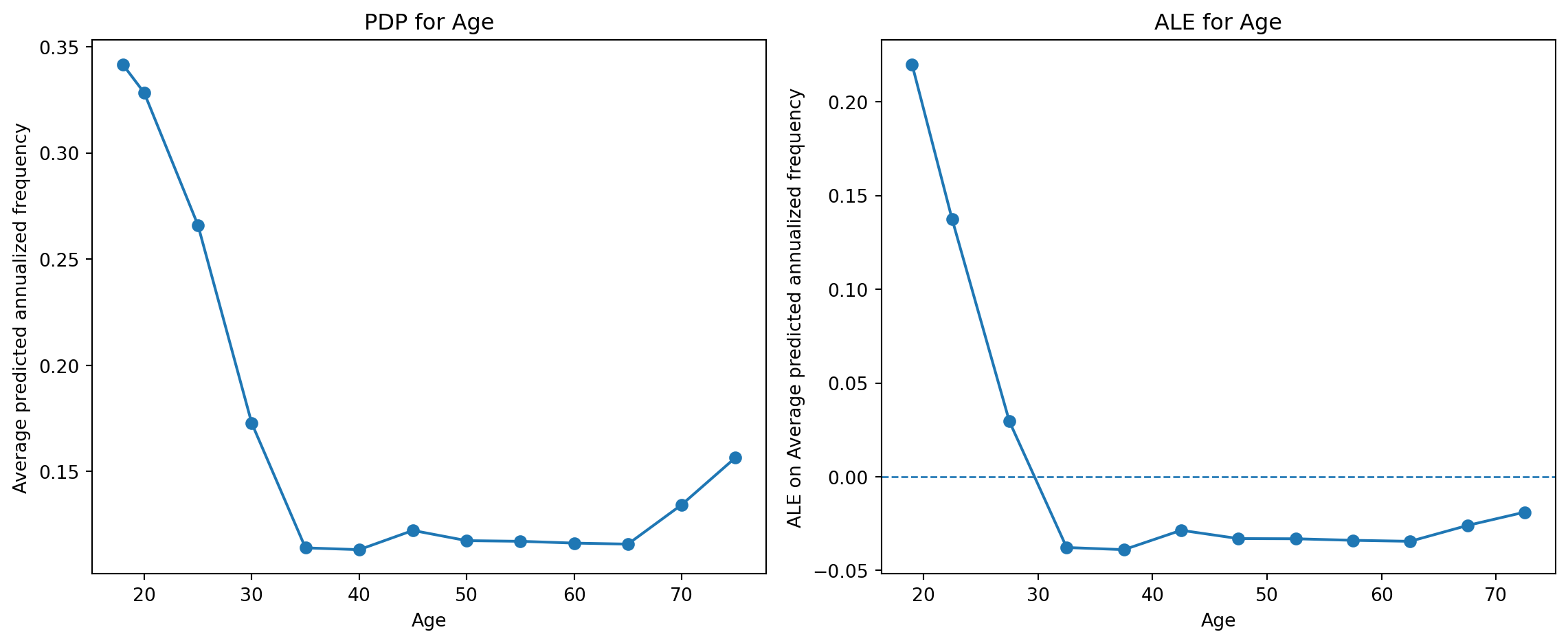
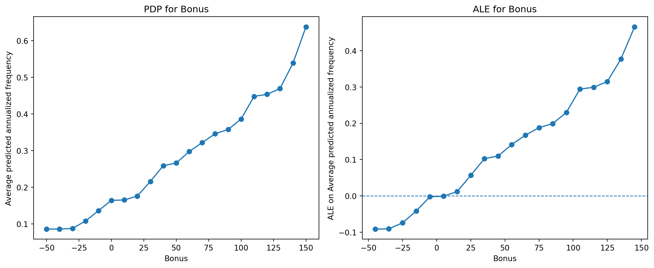
We apply PDP and ALE to **Age** and **Bonus**, two rating factors that are repeatedly used throughout this case study. The PDP curves show the average predicted annualized claim frequency at different values of each variable, while the ALE curves show how local changes in each variable contribute to deviations from the average prediction.
```{python}
#| label: pdp-ale-age
#| code-summary: "Show Age PDP and ALE plots"
age_pdp, age_ale = plot_pdp_ale(
    freq_model,
    predictions,
    "Age",
    X_train.columns,
    "frequency",
    "Average predicted annualized frequency",
    pdp_sample_size=PDP_SAMPLE_SIZE,
    ale_sample_size=ALE_SAMPLE_SIZE
)
```
### Discussion of Age Effects
The PDP and ALE results for **Age** reveal a strong nonlinear relationship between driver age and predicted claim frequency.
Both methods indicate that very young drivers are associated with substantially higher predicted claim frequencies. Predicted risk declines rapidly between approximately ages 18 and 30, after which the effect becomes relatively stable.
The close agreement between the PDP and ALE curves suggests that the estimated age effect is robust and is not strongly influenced by correlations between Age and other predictors. The results are also consistent with actuarial expectations that younger drivers generally exhibit higher claim frequencies.
```{python}
#| label: pdp-ale-bonus
#| code-summary: "Show Bonus PDP and ALE plots"
bonus_pdp, bonus_ale = plot_pdp_ale(
    freq_model,
    predictions,
    "Bonus",
    X_train.columns,
    "frequency",
    "Average predicted annualized frequency",
    pdp_sample_size=PDP_SAMPLE_SIZE,
    ale_sample_size=ALE_SAMPLE_SIZE
)
```
### Discussion of Bonus Effects
The PDP and ALE results for **Bonus** both show a strong positive relationship between the bonus--malus coefficient and predicted claim frequency.
Lower bonus values, which correspond to premium discounts and favourable claims histories, are associated with lower predicted frequencies. In contrast, larger positive bonus values correspond to higher predicted claim frequencies.
The approximately monotonic increase observed in both plots suggests that the fitted model has learned the expected relationship between past claims experience and future claim frequency. The similarity between the PDP and ALE curves again indicates that the estimated effect is relatively stable and not substantially affected by correlations with other predictors.
# SHAP-Based Explanations
**Question this section answers:** *How much does each variable contribute to a specific prediction, and can we explain an individual policy's premium?*
PDP and ALE describe average effects across the portfolio, but a regulator or policyholder may ask. *Why does this particular policy pay this particular premium?* SHAP bridges global and local interpretation. It first provides a portfolio-level ranking of variable contributions (consistent with PDP/ALE findings), and then drills down to a single policy, showing precisely which characteristics push the premium above or below the baseline and by how much. This dual view makes SHAP especially useful for both audit and communication purposes.
Feature importance, PDP, and ALE provide useful global summaries of model behaviour, but they do not directly explain the contribution of individual features to a particular prediction. SHAP provides a unified framework for studying both global and local model behaviour.
SHAP, or Shapley Additive Explanations [@lundberg2017unified], is a model interpretation method derived from cooperative game theory that allocates a model prediction across the input features. The idea borrows from a game in which players share a joint payout. SHAP treats each feature as a player and the model prediction as the payout, and it splits credit for that payout fairly among the features based on their average contribution across every possible order in which they could be added. For a given observation, SHAP values decompose the model prediction into a baseline value and a set of feature contributions.
Intuitively, the baseline value, often denoted by $E[f(X)]$, represents the average model output across the reference observations. Each SHAP value then measures how much a feature pushes the prediction above or below this baseline. Positive SHAP values increase the model output, while negative SHAP values decrease it.
In this case study, SHAP values are computed for the XGBoost Tweedie model using TreeSHAP [@lundberg2018consistent], an efficient algorithm for computing exact SHAP values for tree-based models. The analysis focuses on three visual summaries:
* **Grouped SHAP importance**, which ranks rating variables according to the average magnitude of their contributions to the model output.
* **SHAP beeswarm plot**, which shows the distribution, magnitude, and direction of feature contributions across many policies.
* **SHAP waterfall plot**, which explains one individual prediction by showing how feature contributions move the prediction from the baseline to the final model output.
::: {.callout-note title="Interpretation Does Not Guarantee Trustworthiness"}
SHAP provides a principled framework for explaining model predictions, but interpretation methods should not be viewed as definitive evidence that a model is fair, unbiased, or trustworthy.
@slack2020fooling showed that explanation methods such as LIME and SHAP can sometimes produce misleading explanations, potentially masking undesirable or discriminatory model behaviour.
Consequently, SHAP explanations should be interpreted alongside model validation, fairness assessment, and domain knowledge rather than being treated as definitive explanations of model behaviour.
:::
## SHAP Global Explanation
The global SHAP analysis summarises how features contribute to predictions across many policies in the test set. The code below first computes SHAP values for a sample of test observations and then produces two global summaries.
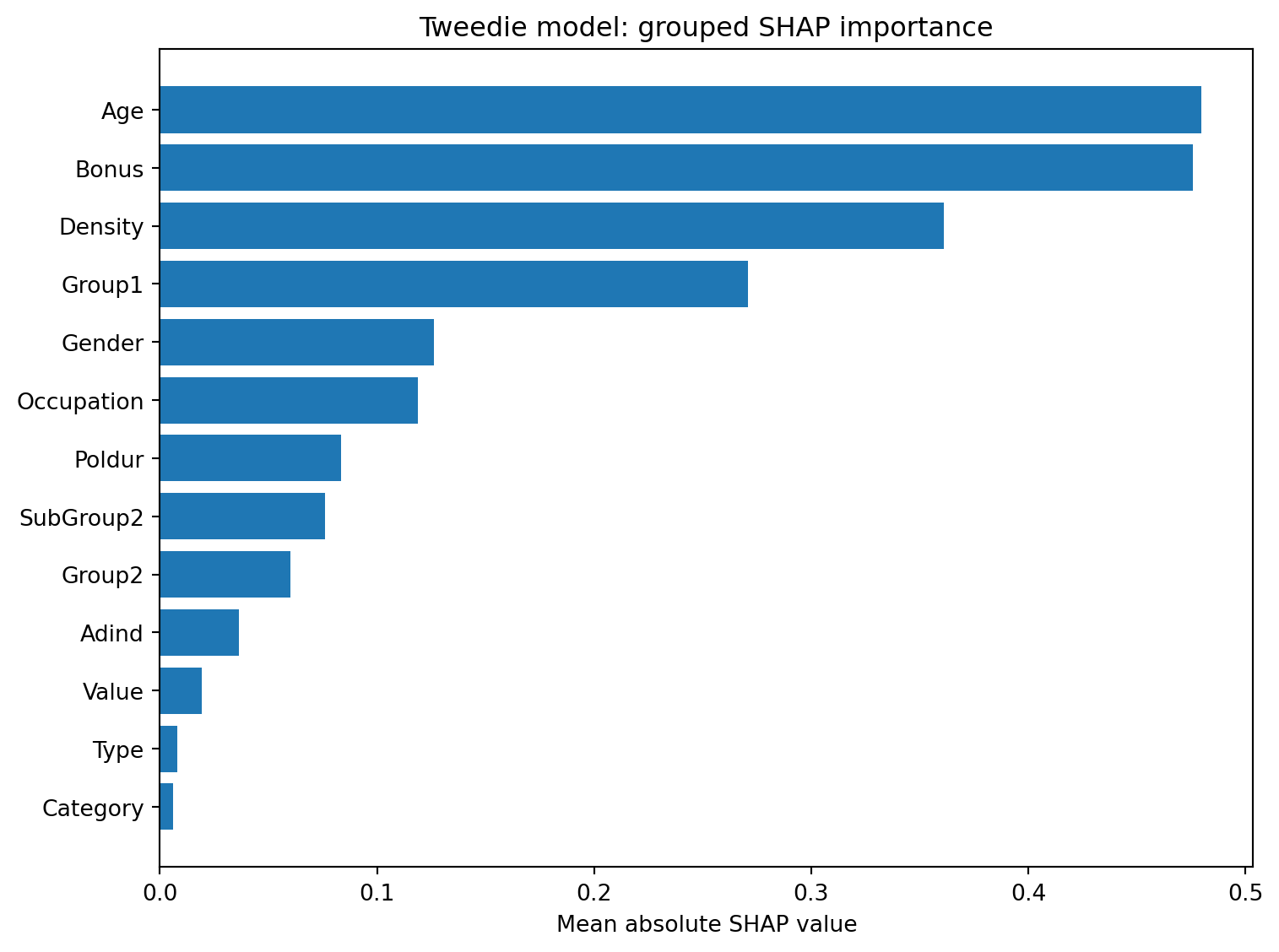
The first plot groups one-hot encoded features back to the original rating variables and ranks them by their mean absolute SHAP value. This is similar in spirit to feature importance, but it is based on the average size of each variable's contribution to the model prediction.
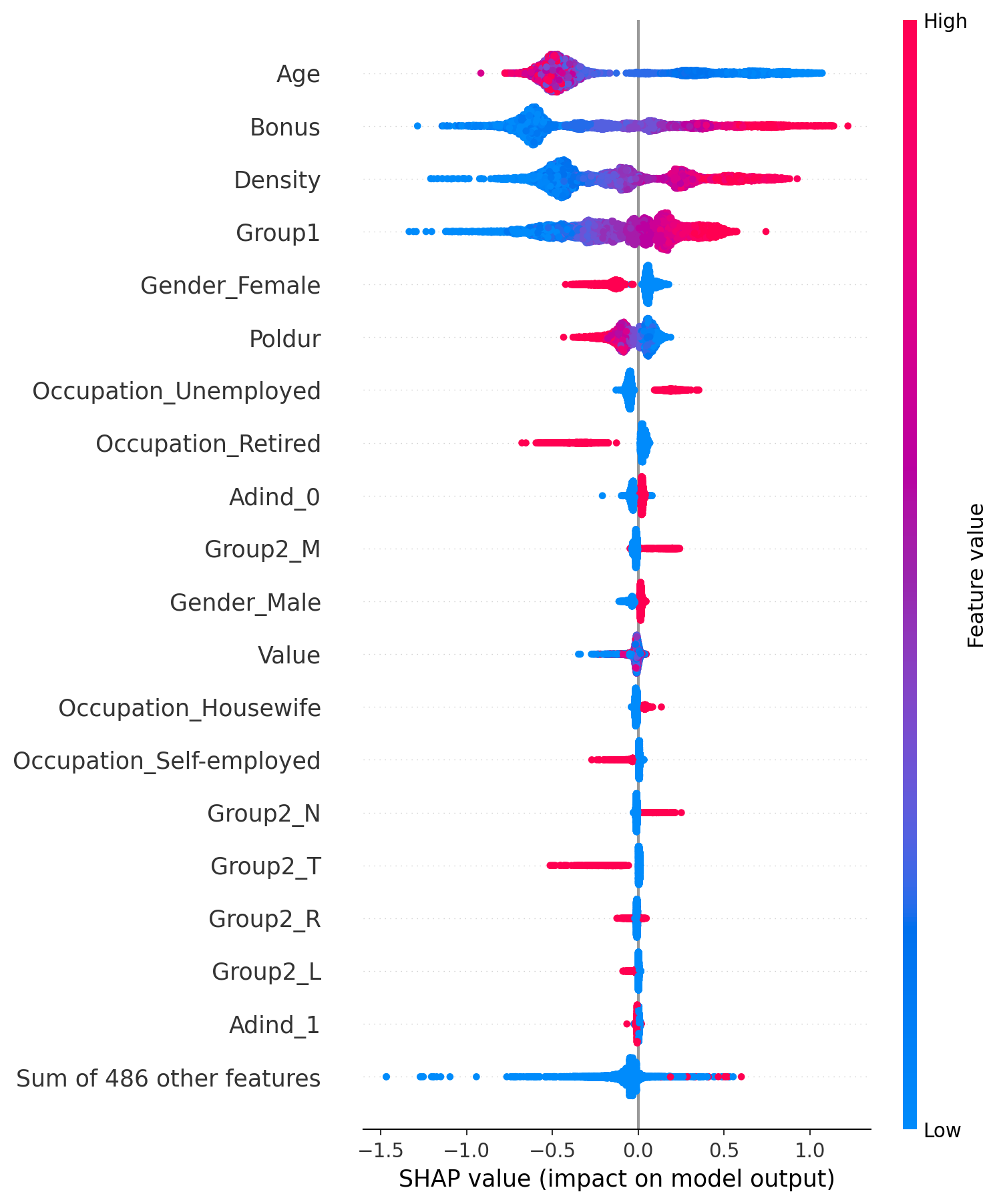
The second plot is a SHAP beeswarm plot. Each point represents one policy and one encoded feature. The horizontal position shows the SHAP value. Points to the right increase the model output, while points to the left decrease it. The colour indicates the feature value, allowing the plot to show whether larger or smaller feature values tend to increase predictions.
```{python}
#| label: shap-grouped-importance
#| code-summary: "Show grouped SHAP importance code"
# Restrict to the best (early-stopped) boosting round, since the raw
# tweedie_model object still contains the later rounds that overfit the test set.
best_tweedie_model = tweedie_model[: tweedie_model.best_iteration + 1]

pred_claim_total_tweedie_best = best_tweedie_model.predict(
    dtest_tweedie
)

pred_pure_premium_tweedie_best = (
    pred_claim_total_tweedie_best
    / test["Exposure"].to_numpy()
)

predictions["PredClaimTotalTweedie"] = (
    pred_claim_total_tweedie_best
)

predictions["PredPurePremiumTweedie"] = (
    pred_pure_premium_tweedie_best
)

X_shap = X_test.sample(
    min(SHAP_SAMPLE_SIZE, len(X_test)),
    random_state=345
)

shap_dmatrix = xgb.DMatrix(
    X_shap,
    base_margin=np.log(
        test.loc[X_shap.index, "Exposure"].to_numpy()
    )
)

shap_explainer_tweedie = shap.TreeExplainer(
    best_tweedie_model
)

# check_additivity=False skips a slow internal consistency check that can fail
# purely from floating-point rounding on a model this size; the SHAP values
# themselves are unaffected.
shap_values_raw = shap_explainer_tweedie(
    shap_dmatrix,
    check_additivity=False
)

# Re-wrap with the plain feature matrix (not the DMatrix), so SHAP's plotting
# functions can show real feature values, e.g. for the beeswarm colour scale.
shap_values = shap.Explanation(
    values=shap_values_raw.values,
    base_values=shap_values_raw.base_values,
    data=X_shap.to_numpy(),
    feature_names=list(X_shap.columns)
)

shap_df = pd.DataFrame(
    shap_values.values,
    columns=X_shap.columns,
    index=X_shap.index
)

grouped_shap = pd.DataFrame(
    index=shap_df.index
)

for col in shap_df.columns:

    group = group_feature_name(
        col,
        features
    )

    if group not in grouped_shap.columns:
        grouped_shap[group] = 0.0

    # SHAP values are additive by construction, so a rating factor's total
    # contribution is just the sum of its one-hot dummies' contributions.
    grouped_shap[group] += shap_df[col]

mean_abs_shap = (
    grouped_shap
    .abs()
    .mean()
    .sort_values(ascending=False)
)

plot_data = (
    mean_abs_shap
    .head(15)
    .sort_values()
)

plt.figure(figsize=(8, 6))

plt.barh(
    plot_data.index,
    plot_data.values
)

plt.xlabel("Mean absolute SHAP value")
plt.title(
    "Tweedie model: grouped SHAP importance"
)

plt.tight_layout()
plt.show()
```
The grouped SHAP importance plot indicates that **Bonus**, **Age**, and **Density** are the most influential rating variables in the Tweedie model, followed by **Group1** and several demographic and vehicle characteristics.
The ranking is broadly consistent with the permutation importance analysis presented earlier, suggesting that these variables contribute substantially to predictive performance and also have large effects on individual predictions.
In particular, the relatively high importance of **Bonus** and **Age** is consistent with the PDP and ALE analyses, which showed strong nonlinear relationships between these variables and the predicted pure premium.
```{python}
#| label: shap-beeswarm
#| code-summary: "Show SHAP beeswarm plot"
shap.plots.beeswarm(
    shap_values,
    max_display=20,
    show=False
)

plt.tight_layout()
plt.show()
```
The SHAP beeswarm plot provides additional information about both the magnitude and the direction of feature effects.
For **Bonus**, larger values are generally associated with positive SHAP values, indicating that higher Bonus levels tend to increase predicted premiums. Similarly, larger values of **Density** are associated with higher predicted premiums.
For **Age**, the relationship appears more complex. Younger drivers tend to produce positive SHAP values, whereas older drivers often reduce the predicted premium, suggesting a nonlinear age effect.
The horizontal spread of the points indicates the variability of the feature effect across policies. Features with a wider spread, such as **Bonus** and **Age**, contribute more strongly to differences in predicted premiums.
## SHAP Local Explanation
Global SHAP plots describe average patterns across many policies, but they do not explain why a particular policy receives a particular prediction. Local SHAP explanations address this by decomposing one individual prediction into feature-level contributions.
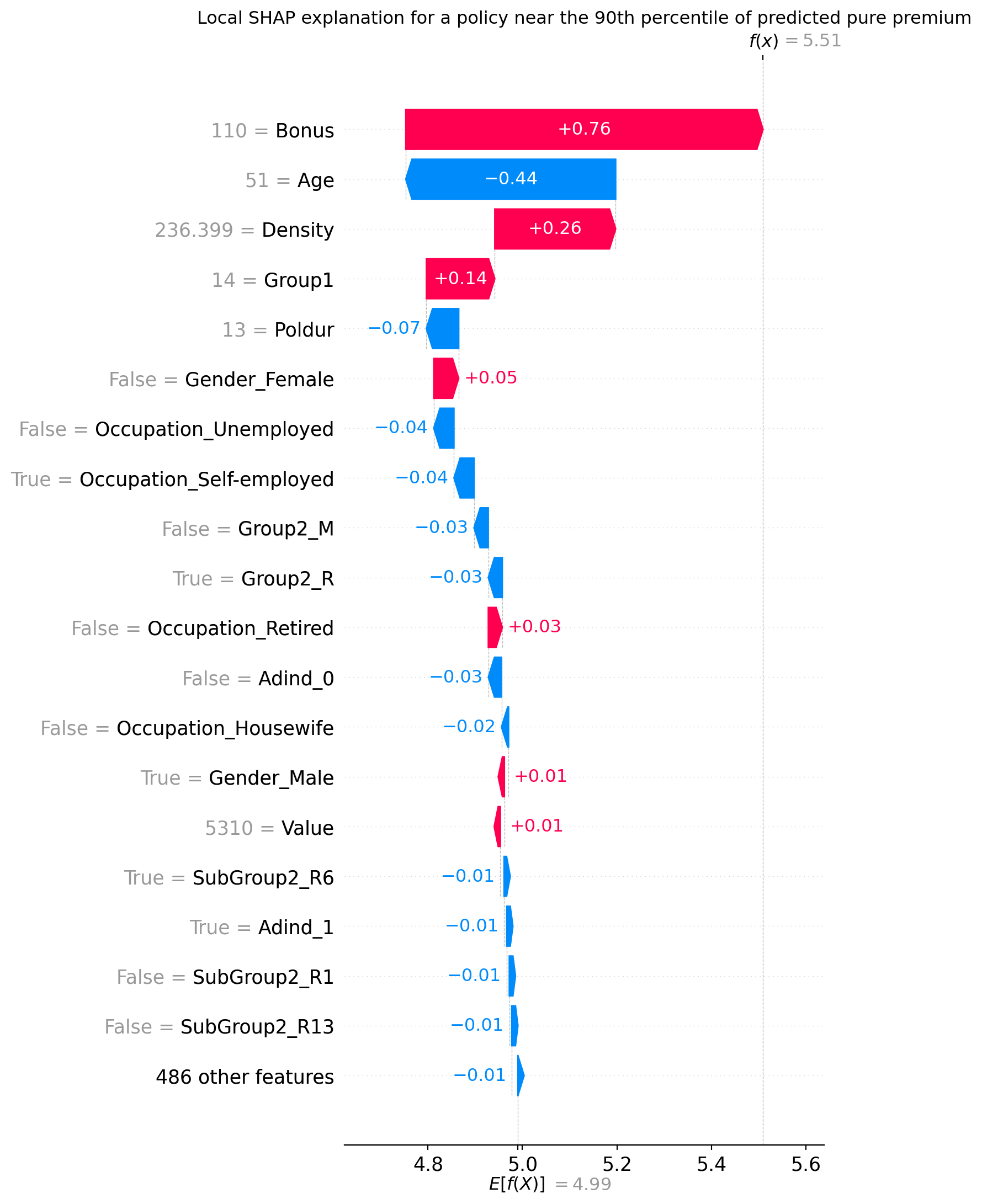
In this example, we select a policy whose predicted pure premium is close to the 90th percentile of the test-set predictions. This avoids focusing only on the single highest-premium policy, which may be an extreme observation, while still providing an example of a relatively high predicted premium.
The waterfall plot starts from the baseline model output and then adds the SHAP contributions of individual features until it reaches the prediction for the selected policy. Features shown in red increase the prediction, while features shown in blue decrease it.
For the Tweedie model, the SHAP values are computed on the model margin (log) scale used internally by XGBoost. Consequently, the quantities $E[f(X)]$ and $f(x)$ shown in the waterfall plot are expressed on the log-prediction scale rather than the pure premium scale. Exponentiating $f(x)$ recovers the predicted pure premium for the selected policy.
```{python}
#| label: shap-local
#| code-summary: "Show local SHAP explanation code"
LOCAL_PREMIUM_QUANTILE = 0.90

target_premium = predictions["PredPurePremiumTweedie"].quantile(
    LOCAL_PREMIUM_QUANTILE
)

# Pick the real policy whose predicted premium is closest to that target,
# rather than the single highest-premium policy, which could be an
# unrepresentative outlier.
local_index = (
    predictions["PredPurePremiumTweedie"]
    .sub(target_premium)
    .abs()
    .idxmin()
)

X_local = make_design_matrix(
    predictions.loc[[local_index]]
).reindex(columns=X_train.columns, fill_value=0)

dmatrix_local_tweedie = xgb.DMatrix(
    X_local,
    base_margin=np.log(
        predictions.loc[[local_index], "Exposure"].to_numpy()
    )
)

shap_local_raw = shap_explainer_tweedie(
    dmatrix_local_tweedie,
    check_additivity=False
)

# Take just this one row out of the batch explanation, so the waterfall plot
# below shows a single policy rather than a summary across many.
shap_local_named = shap.Explanation(
    values=shap_local_raw.values[0],
    base_values=shap_local_raw.base_values[0],
    data=X_local.iloc[0].to_numpy(),
    feature_names=list(X_local.columns)
)

shap.plots.waterfall(
    shap_local_named,
    max_display=20,
    show=False
)

plt.title(
    f"Local SHAP explanation for a policy near the "
    f"{int(LOCAL_PREMIUM_QUANTILE * 100)}th percentile of predicted pure premium"
)

plt.tight_layout()
plt.show()

local_policy = predictions.loc[[local_index]][
    [
        "Age",
        "Bonus",
        "Density",
        "Gender",
        "Occupation",
        "Type",
        "Group1",
        "Group2",
        "SubGroup2",
        "Poldur",
        "Value",
        "Category",
        "Adind",
        "Exposure",
        "PredPurePremiumTweedie"
    ]
]

local_policy
```
The local SHAP explanation illustrates how the prediction for one particular policy is constructed from the baseline prediction.
For this policy, the largest positive contributions come from **Age = 20** and **Density = 236.4**, both of which substantially increase the predicted pure premium. In contrast, **Group1 = 5** and **Bonus = -10** reduce the prediction relative to the baseline.
The waterfall plot therefore provides an intuitive decomposition of the model prediction by quantifying how each characteristic contributes to the final premium estimate.
The explanation is also broadly consistent with the global analyses. For example, **Age**, **Bonus**, and **Density** were identified as highly influential variables in the grouped SHAP importance plot and exhibit some of the largest contributions for this individual policy.
::: {.callout-note title="Interpreting the SHAP Scale"}
The values shown in the waterfall plot correspond to the model margin used internally by the XGBoost Tweedie model. Since the Tweedie model uses a log link, the displayed values are on the log-prediction scale.
The predicted pure premium can be recovered by exponentiating the final value:
$$
\text{Predicted pure premium}
=
\exp(f(x)).
$$
:::
## Local What-if Analysis
Local SHAP explanations identify the variables that contribute to an individual prediction, but they do not directly answer a practical question that many users may ask:
> What would happen if one characteristic of this policy changed?
To address this question, we perform a simple local what-if analysis. Starting from the selected policy, each predictor is modified individually while all remaining characteristics are held fixed. The resulting change in the predicted pure premium provides a measure of the local sensitivity of the prediction to that variable.
This analysis is related to the idea of **counterfactual explanations**, which seek alternative feature values that would produce a substantially different prediction. However, unlike formal counterfactual methods, the present analysis does not attempt to find an optimal or realistic combination of changes. Instead, it varies one variable at a time using representative reference values, making the results easy to interpret and suitable for exploratory analysis.
For continuous variables, the reference value is taken as the sample median, while categorical variables are replaced by their most common category. The resulting changes in predicted premium provide a simple indication of which characteristics have the largest influence on the selected policy.
```{python}
#| label: local-premium-impact
#| code-summary: "Show local premium impact analysis code"
from pandas.api.types import CategoricalDtype

def predict_tweedie_pure_premium(data):
    X = make_design_matrix(data).reindex(
        columns=X_train.columns,
        fill_value=0
    )

    dmatrix = xgb.DMatrix(
        X,
        base_margin=np.log(data["Exposure"])
    )

    pred_total = best_tweedie_model.predict(dmatrix)

    return pred_total / data["Exposure"].to_numpy()

def local_premium_impact(data, row_index, variables):
    base_policy = data.loc[[row_index]].copy()
    base_premium = predict_tweedie_pure_premium(base_policy)[0]

    rows = []

    for variable in variables:

        # Use the mode for categorical/text variables and the median for
        # numeric ones as a single, representative "typical" reference value.
        if (
            isinstance(data[variable].dtype, CategoricalDtype)
            or data[variable].dtype == object
        ):
            reference_value = data[variable].mode().iloc[0]
        else:
            reference_value = data[variable].median()

        # Swap just this one variable to the reference value, holding
        # everything else about the policy fixed, and see how much the
        # prediction moves.
        reference_policy = base_policy.copy()
        reference_policy[variable] = reference_value

        reference_premium = predict_tweedie_pure_premium(
            reference_policy
        )[0]

        rows.append({
            "Variable": variable,
            "Observed value": base_policy[variable].iloc[0],
            "Reference value": reference_value,
            "Predicted premium": base_premium,
            "Reference premium": reference_premium,
            "Premium impact": base_premium - reference_premium
        })

    impact_table = pd.DataFrame(rows)

    impact_table = impact_table.sort_values(
        "Premium impact",
        key=lambda x: np.abs(x),
        ascending=False
    )

    return impact_table

impact_variables = [
    "Bonus",
    "Age",
    "Density",
    "Gender",
    "Occupation",
    "Group1",
    "Group2",
    "SubGroup2",
    "Poldur",
    "Value"
]

local_impact_table = local_premium_impact(
    predictions,
    local_index,
    impact_variables
)

local_impact_table.style.hide(axis="index")
```
The results indicate that **Age**, **Group1**, **Bonus**, and **Density** produce the largest changes in predicted premium under the one-variable-at-a-time reference scenarios. Younger age, higher density, and the observed bonus level all contribute substantially to the selected policy's predicted premium. For **Gender** and **Occupation**, the observed values are the same as the reference values, so this particular what-if comparison produces no change. This should not be interpreted as evidence that these variables have no effect in the model. The conclusions are broadly consistent with the local SHAP explanation.
::: {.callout-note title="From What-if Analysis to Counterfactual Explanations"}
Feature importance measures identify which variables are important to the model, while SHAP explanations help explain why a particular prediction was made. Counterfactual explanations, in contrast, focus on how a prediction could be changed.
The present analysis changes one predictor at a time while keeping all other characteristics fixed. This provides a simple form of **local what-if analysis** and addresses questions such as:
> *"How would the predicted premium change if this characteristic were different?"*
This can be viewed as a simple form of counterfactual reasoning. Formal counterfactual explanations extend this idea by searching for changes that achieve a specific prediction outcome.
For example, if a policy has a high predicted premium, a counterfactual explanation might identify a combination of changes to the policy characteristics that would reduce the premium below a specified threshold.
Formal counterfactual methods typically:
- modify several variables simultaneously;
- search for the smallest change required to achieve a desired prediction outcome; and
- often impose additional constraints to ensure that the proposed changes are realistic and feasible.
Consequently, formal counterfactual explanations can be viewed as a natural extension of the local what-if analysis presented in this case study.
:::
# Understanding Interaction Effects
**Question this section answers:** *Does the effect of one variable depend on another, and where does this matter?*
The methods in the preceding sections treat each variable's effect independently. But machine learning models routinely capture interactions. The premium uplift for a young driver may be amplified by a high bonus level, or the effect of population density may differ across vehicle categories. Ignoring interactions can lead to misleading single-variable summaries. This section introduces two complementary approaches, Friedman's H-statistic for a global interaction audit and SHAP interaction values for observation-level attribution, to detect and quantify these combined effects.
Interactions occur when the effect of one predictor depends on the value of another predictor. In an additive model, the contribution of each predictor is independent and the total prediction can be obtained by summing the individual effects. Tree-based machine learning models, however, often capture complex interactions automatically.
For example, the influence of age may differ between drivers with high and low bonus levels, or the effect of population density may vary across different driver groups. When strong interactions are present, the combined effect of two variables cannot be explained simply by adding their individual effects. Understanding these interactions can provide additional insight into the behaviour of complex machine learning models.
In this section, we consider two complementary approaches for studying interaction effects:
* **Friedman's H-statistic**, which measures the overall strength of non-additive interactions between two predictors.
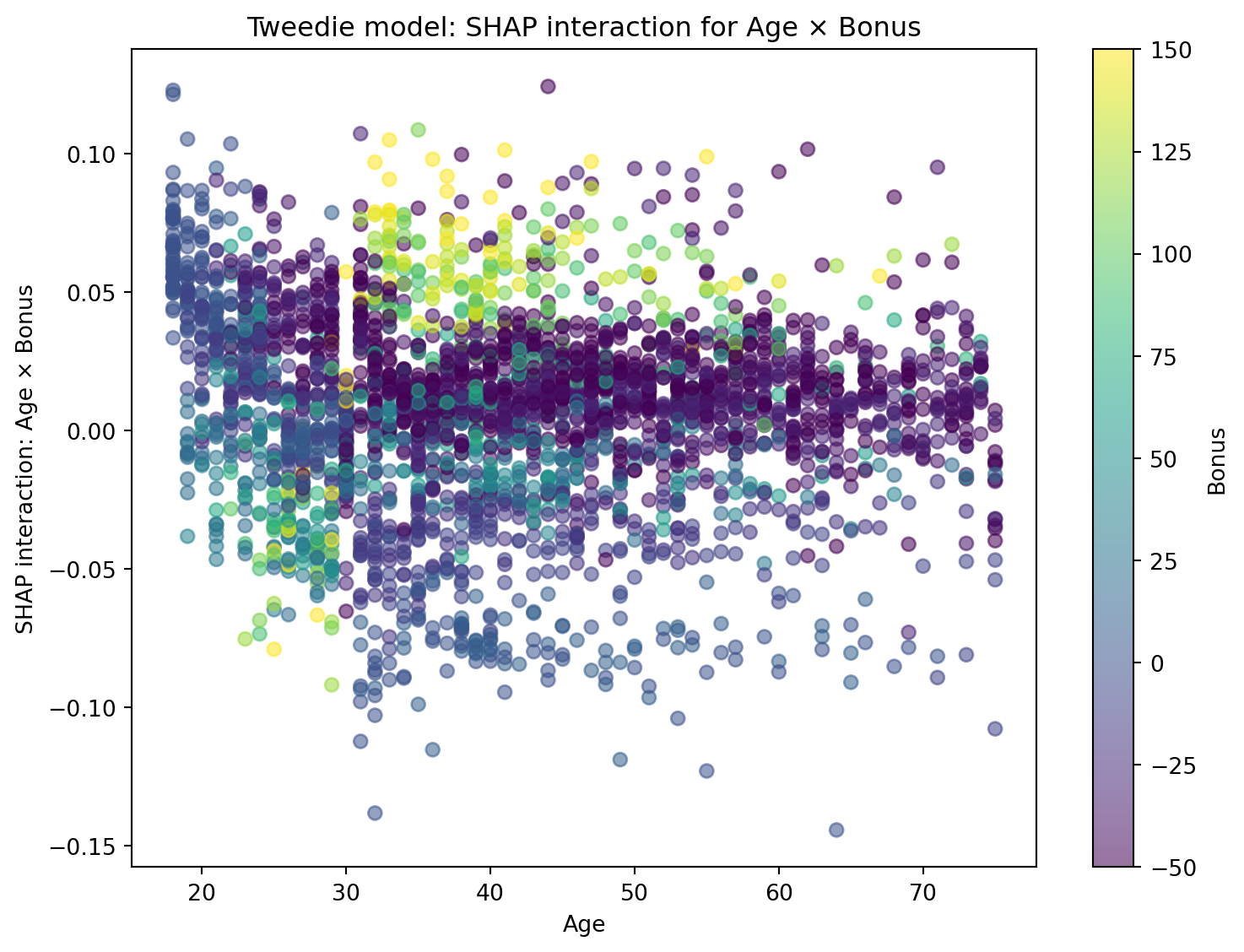
* **SHAP interaction values**, which allocate interaction effects to individual predictions.
## Friedman's H-statistic
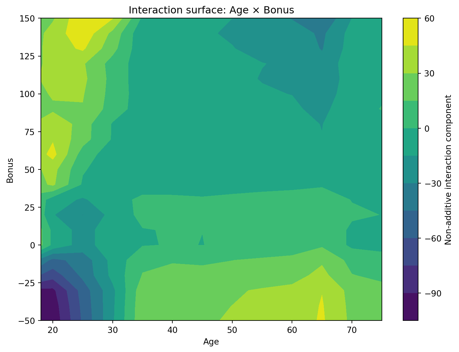
Friedman's H-statistic [@friedman2008predictive] measures the degree to which the joint effect of two variables departs from an additive relationship. If the effect of two variables can be explained entirely by adding their individual effects, the interaction strength is zero.
The method is based on two-dimensional partial dependence functions. The joint effect of two predictors is compared with the additive combination of their individual effects, and the remaining non-additive component is used to quantify the interaction strength.
The H-statistic ranges between 0 and 1:
* Values close to 0 indicate little evidence of interaction.
* Larger values indicate stronger departures from additivity.
To visualise the interaction, we also display the estimated interaction surface. Positive values indicate combinations of predictor values that increase the prediction beyond what would be expected from additive effects alone, whereas negative values indicate combinations that reduce the prediction.
```{python}
#| label: interaction-helper-functions
#| code-summary: "Show interaction helper functions"
def compute_2d_pdp(
    model,
    data,
    var1,
    var2,
    reference_columns,
    model_type="tweedie",
    sample_size=None
):
    if sample_size is not None and sample_size < len(data):
        data_used = data.sample(
            sample_size,
            random_state=RANDOM_STATE
        ).copy()
    else:
        data_used = data.copy()

    grid1 = effect_grid(var1, data_used, n_grid=12)
    grid2 = effect_grid(var2, data_used, n_grid=12)

    surface = np.zeros((len(grid1), len(grid2)))

    # Evaluate the model's average prediction at every combination of the two
    # variables' grid values: the 2D generalisation of a single-variable PDP.
    for i, value1 in enumerate(grid1):
        for j, value2 in enumerate(grid2):

            temp = data_used.copy()

            temp[var1] = value1
            temp[var2] = value2

            pred = prediction_for_effect_plot(
                model,
                temp,
                reference_columns=reference_columns,
                model_type=model_type
            )

            surface[i, j] = np.mean(pred)

    return grid1, grid2, surface

def compute_h_statistic(
    model,
    data,
    var1,
    var2,
    reference_columns,
    model_type="tweedie",
    sample_size=None
):
    grid1, grid2, pdp_2d = compute_2d_pdp(
        model,
        data,
        var1,
        var2,
        reference_columns,
        model_type=model_type,
        sample_size=sample_size
    )

    pdp_1 = pdp_2d.mean(axis=1)   # var1's own 1D PDP, recovered by averaging out var2
    pdp_2 = pdp_2d.mean(axis=0)   # var2's own 1D PDP, recovered by averaging out var1
    pdp_mean = pdp_2d.mean()

    # What the joint surface WOULD look like if the two variables' effects were
    # purely additive (no interaction) — Friedman's H-statistic definition.
    additive_surface = (
        pdp_1[:, None]
        + pdp_2[None, :]
        - pdp_mean
    )

    # The leftover, non-additive part of the joint surface: the interaction.
    interaction_surface = (
        pdp_2d
        - additive_surface
    )

    denominator = np.var(pdp_2d)

    # H = the share of the joint surface's variance that the interaction
    # accounts for; 0 means fully additive, larger values mean a stronger interaction.
    h_value = (
        0.0
        if denominator <= 0
        else np.sqrt(
            np.var(interaction_surface)
            / denominator
        )
    )

    return (
        h_value,
        grid1,
        grid2,
        pdp_2d,
        interaction_surface
    )

def plot_interaction_surface(
    grid1,
    grid2,
    surface,
    var1,
    var2,
    colorbar_label="Interaction component"
):
    plt.figure(figsize=(8, 6))

    X_grid, Y_grid = np.meshgrid(
        grid1,
        grid2
    )

    contour = plt.contourf(
        X_grid,
        Y_grid,
        surface.T,
        levels=15
    )

    plt.xlabel(var1)
    plt.ylabel(var2)

    plt.title(
        f"Interaction surface: {var1} × {var2}"
    )

    plt.colorbar(
        contour,
        label=colorbar_label
    )

    plt.tight_layout()
    plt.show()
```
```{python}
#| label: h-statistic-interactions
#| code-summary: "Show H-statistic interaction code"
interaction_pairs = [
    ("Age", "Bonus"),
    ("Age", "Density"),
    ("Age", "Poldur"),
    ("Bonus", "Density"),
    ("Bonus", "Poldur"),
    ("Density", "Poldur")
]

h_results = []

for var1, var2 in interaction_pairs:

    (
        h_value,
        grid1,
        grid2,
        pdp_2d,
        interaction_surface
    ) = compute_h_statistic(
        tweedie_model,
        predictions,
        var1,
        var2,
        X_train.columns,
        model_type="tweedie",
        sample_size=INTERACTION_SAMPLE_SIZE
    )

    h_results.append({
        "Variable 1": var1,
        "Variable 2": var2,
        "H-statistic": round(h_value, 4)
    })

    # Only display the most interpretable interaction surface
    if (var1, var2) == ("Age", "Bonus"):

        plot_interaction_surface(
            grid1,
            grid2,
            interaction_surface,
            var1,
            var2,
            colorbar_label="Non-additive interaction component"
        )

h_results = (
    pd.DataFrame(h_results)
    .sort_values(
        "H-statistic",
        ascending=False
    )
    .reset_index(drop=True)
)

h_results.style.hide(axis="index")
```
The H-statistic summarises the overall strength of an interaction, whereas the interaction surface shows where the interaction occurs.
The H-statistics indicate that the strongest interactions occur between Age and Density, followed by Bonus and Density, whereas the interaction between Age and Bonus is comparatively weaker. Nevertheless, the results suggest that the Tweedie model contains meaningful non-additive effects.
The interaction surface for Age and Bonus illustrates how the interaction varies across the predictor space. Most regions exhibit relatively small interaction effects, although some combinations of age and bonus produce predictions that are either larger or smaller than would be expected under an additive model. This indicates that the effect of age depends to some extent on the driver's bonus level.
::: {.callout-note title="How Is the H-statistic Related to PDPs?"}
For a predictor $x_j$, the one-dimensional partial dependence function is
$$
PD_j(x_j)
=
E_{X_{-j}}
\left[
f(x_j, X_{-j})
\right],
$$
which represents the average model prediction obtained by fixing $x_j$ and averaging over all remaining predictors.
Similarly, the two-dimensional partial dependence function for variables $x_j$ and $x_k$ is
$$
PD_{jk}(x_j,x_k)
=
E_{X_{-(j,k)}}
\left[
f(x_j, x_k, X_{-(j,k)})
\right].
$$
Following @friedman2008predictive, the partial dependence functions are assumed to be centred so that their average values are zero. Under an additive model with no interaction between $x_j$ and $x_k$,
$$
PD_{jk}(x_j,x_k)
=
PD_j(x_j)
+
PD_k(x_k).
$$
Any departure from this additive relationship can therefore be interpreted as an interaction effect:
$$
I_{jk}(x_j,x_k)
=
PD_{jk}(x_j,x_k)
-
PD_j(x_j)
-
PD_k(x_k),
$$
where $I_{jk}(x_j,x_k)$ represents the non-additive component of the joint effect.
The interaction surface shown above visualises this interaction component. Friedman's H-statistic summarises its overall magnitude by comparing the squared interaction effect with the overall variation in the two-dimensional partial dependence function:
$$
H_{jk}^{2}
=
\frac{
\sum_{i=1}^{n}
I_{jk}(x^{(i)}_{j},x^{(i)}_{k})^{2}
}
{
\sum_{i=1}^{n}
PD_{jk}(x^{(i)}_{j},x^{(i)}_{k})^{2}
}.
$$
Values close to zero indicate an approximately additive relationship, whereas larger values suggest stronger interactions between the two variables.
:::
## SHAP Interaction Values
SHAP interaction values extend SHAP explanations by decomposing the prediction into both main effects and pairwise interaction effects. The interaction contribution between two variables measures how much their joint effect differs from the sum of their individual contributions.
Unlike the H-statistic, which provides a global measure of interaction strength, SHAP interaction values are computed for individual observations. By aggregating these values across many observations, it is possible to visualise how interactions vary throughout the data.
In the plot below, the vertical axis shows the interaction contribution between Age and Bonus. The horizontal axis represents Age, while the colour indicates the value of Bonus. Large positive or negative interaction values suggest that the effect of Age depends on the Bonus level.
```{python}
#| label: shap-interaction-plots
#| code-summary: "Show SHAP interaction plot code"
X_interaction = X_test.sample(
    min(SHAP_INTERACTION_SAMPLE_SIZE, len(X_test)),
    random_state=RANDOM_STATE
)

data_interaction = predictions.loc[X_interaction.index].copy()

dmatrix_interaction = xgb.DMatrix(
    X_interaction,
    base_margin=np.log(
        test.loc[X_interaction.index, "Exposure"].to_numpy()
    )
)

# Returns one interaction matrix per observation (features x features), giving
# the pairwise SHAP interaction for every pair of encoded columns, not just the
# one pair we ultimately plot below.
interaction_values = shap_explainer_tweedie.shap_interaction_values(
    dmatrix_interaction
)

if isinstance(interaction_values, list):
    interaction_values = interaction_values[0]   # some SHAP versions wrap the array in a list

feature_names = list(X_interaction.columns)

def plot_grouped_shap_interaction(var1, var2):
    # Find every one-hot dummy column belonging to each of the two rating factors.
    cols1 = [
        col for col in feature_names
        if group_feature_name(col, features) == var1
    ]

    cols2 = [
        col for col in feature_names
        if group_feature_name(col, features) == var2
    ]

    idx1 = [feature_names.index(col) for col in cols1]
    idx2 = [feature_names.index(col) for col in cols2]

    # Sum the interaction values across every dummy-pair combination, to
    # recover a single interaction-per-policy figure for the two original variables.
    pair_interaction = (
        interaction_values[:, idx1, :]
        [:, :, idx2]
        .sum(axis=(1, 2))
    )

    plt.figure(figsize=(8, 6))

    scatter = plt.scatter(
        data_interaction[var1],
        pair_interaction,
        c=data_interaction[var2],
        alpha=0.55
    )

    plt.xlabel(var1)
    plt.ylabel(f"SHAP interaction: {var1} × {var2}")
    plt.title(f"Tweedie model: SHAP interaction for {var1} × {var2}")

    plt.colorbar(
        scatter,
        label=var2
    )

    plt.tight_layout()
    plt.show()

plot_grouped_shap_interaction(
    "Age",
    "Bonus"
)
```
The SHAP interaction plot provides an observation-level view of the interaction between Age and Bonus. Each point represents one policy. The horizontal axis shows Age, the vertical axis shows the SHAP interaction contribution between Age and Bonus, and the colour indicates the Bonus value.
Most interaction values are concentrated close to zero, suggesting that the interaction effect is generally modest for many policies. However, some observations exhibit larger positive or negative interaction contributions, indicating that the effect of Age varies depending on the Bonus level.
The absence of a single clear trend also suggests that the interaction is heterogeneous across the portfolio. This is consistent with the moderate H-statistic obtained for Age and Bonus, indicating that the interaction exists but is not among the strongest interactions in the model.
# Summary
- The same workflow (fit an accurate model, check global importance, check main effects, check individual predictions, check interactions, validate and communicate) applies to any fitted tabular model, not only the XGBoost pricing models used here.
- No single method tells the whole story. Built-in and permutation importance can disagree, PDP and ALE can disagree under correlated predictors, and global SHAP importance can mask heterogeneous local behaviour.
- Interaction diagnostics (the H-statistic, SHAP interaction values) reveal where the additive, one-variable-at-a-time picture from PDP/ALE and global SHAP breaks down.
- Explanations are for an audience. Technical reviewers, regulators, and affected individuals need different summaries of the same fitted model.
# Recommended reading
**Further reading**
- @molnar2025iml — comprehensive reference for every method used in this chapter (permutation importance, PDP, ALE, SHAP, H-statistic), not specific to insurance.
- @baeder2021iml — SOA report situating this toolkit within insurance pricing practice.
- @naic2025modelreview — regulatory expectations for model review and documentation.
- @ribeiro2016should — LIME, a local surrogate-model alternative to SHAP not covered in the walkthrough.
- @rudin2019stop — the case for preferring inherently interpretable models over post-hoc explanation of black boxes.